
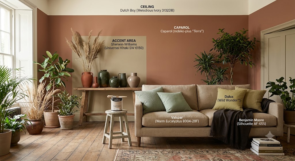
As we move through 2026, the paint color landscape has shifted away from the sterile, cool-toned environments of the past toward spaces defined by warmth, personality, and a deep connection to nature. This year is all about “grounded elegance,” with top paint brands moving collectively toward rich, earthy neutrals and sophisticated, nature-inspired hues.
The Top Colors of the Year
This selection combines the previously highlighted industry favorites with top choices from Caparol, Dulux, and Crown to offer a refined, versatile palette for your projects:
- Sherwin-Williams (Universal Khaki SW 6150): A timeless, warm neutral that brings grounded elegance and acts as a versatile anchor for any room.
- Benjamin Moore (Silhouette AF-655): A refined blend of burnt umber and charcoal, offering depth and dramatic sophistication.
- Valspar (Warm Eucalyptus 8004-28F): A soothing, muted green that captures our collective need for calm and comfort.
- Dunn-Edwards (Midnight Garden DE5657): A deep, botanical green that balances modern sophistication with earthy resilience.
- Dutch Boy (Melodious Ivory 3132DB): A creamy, soft neutral that promotes a sense of intentional, cozy living.
- Caparol (Indeko-plus “Terra”): A highly durable, earth-toned pigment that aligns with the move toward mineral-based, grounding neutrals.
- Dulux (Wild Wonder™): An earthy, glowing yellow-tone that brings a sense of energy and connection to the natural world.
- Crown (Cashmere): A warm, soft-touch neutral that provides a sophisticated backdrop, perfect for those moving away from stark, flat grays.
Key Trends to Watch
- The Death of ‘Sad Beige’ and Sterile Gray: 2026 is saying goodbye to flat, impersonal cool grays. They are being replaced by “mushroom” tones, rich taupes, and warm, mineral-based neutrals that feel alive.
- Layering for Depth: Rather than uniform white walls, designers are embracing layered palettes. This involves mixing deep, moody accents with softer, ethereal pales.
- Nature’s Palette: From terracotta and rust to botanical greens and dusky mauves, colors are being pulled directly from the earth to turn our homes into true sanctuaries.
- Personality over Perfection: The goal for 2026 is spaces that feel curated and personal. Designers recommend not being afraid to use rich, saturated colors in unexpected places like cabinetry, ceilings, or trim.
Ultimately, 2026 is about creating a refuge. By embracing these warmer, more complex hues, you can build a home that feels both timeless and deeply connected to your personal style.